

Design Philosophy
Design is only successful when real people can complete real tasks with less friction, less guessing, and fewer surprises, on both the customer and operations side.
Accessible & Grounded
Design for different levels of attention, devices, and accessibility needs, using clear language, strong hierarchy, and sensible defaults so interfaces feel calm instead of overwhelming, and always considering support, content, and workflows so designs stay maintainable over time.
Behaviour First
Start from what people are actually trying to do, then shape flows and screens so those tasks are simple and obvious, using research, observation, and data to ground decisions in real behaviour, and prioritizing changes that reduce confusion, drop‑offs, and errors over cosmetic tweaks.
Human-Centered Design
Anchor decisions in real users’ needs, constraints, and contexts rather than stakeholder assumptions, creating reusable patterns and clear interaction rules so interfaces feel intuitive, and balancing user needs with operational realities so designs can actually be delivered.
Design Process

Learn From Uses
Dig into how people currently work or use the product through interviews, observations, and lightweight surveys, then turn those findings into needs, pain points, and simple personas instead of long, theoretical profiles

Explore & Structure Solutions
Sketch options, test information architecture, and outline interaction patterns, moving from rough concepts to clearer structures that connect screens, content, and states into one coherent experience

Design & Refine the Interface
Create high‑fidelity layouts that combine hierarchy, visual language, and microcopy to make the flows feel intuitive and on‑brand, iterating based on feedback from both users and collaborators

Ship, Learn, Iterate
Hand off designs with the context teams need to build them, then watch how people actually use the new experience, capturing insights to make targeted adjustments rather than treating the first release as final

Understand the Problem
Start by clarifying what is actually broken or missing for both users and the business, using existing data, stakeholder conversations, and any known constraints to define a realistic problem statement and scope

Map Journeys & Flows
Translate what you learned into user journeys and flow diagrams that show each step, decision, and edge case, so everyone can see where friction appears and where a new or improved experience should start and end
Featured Projects
Concept Prototype
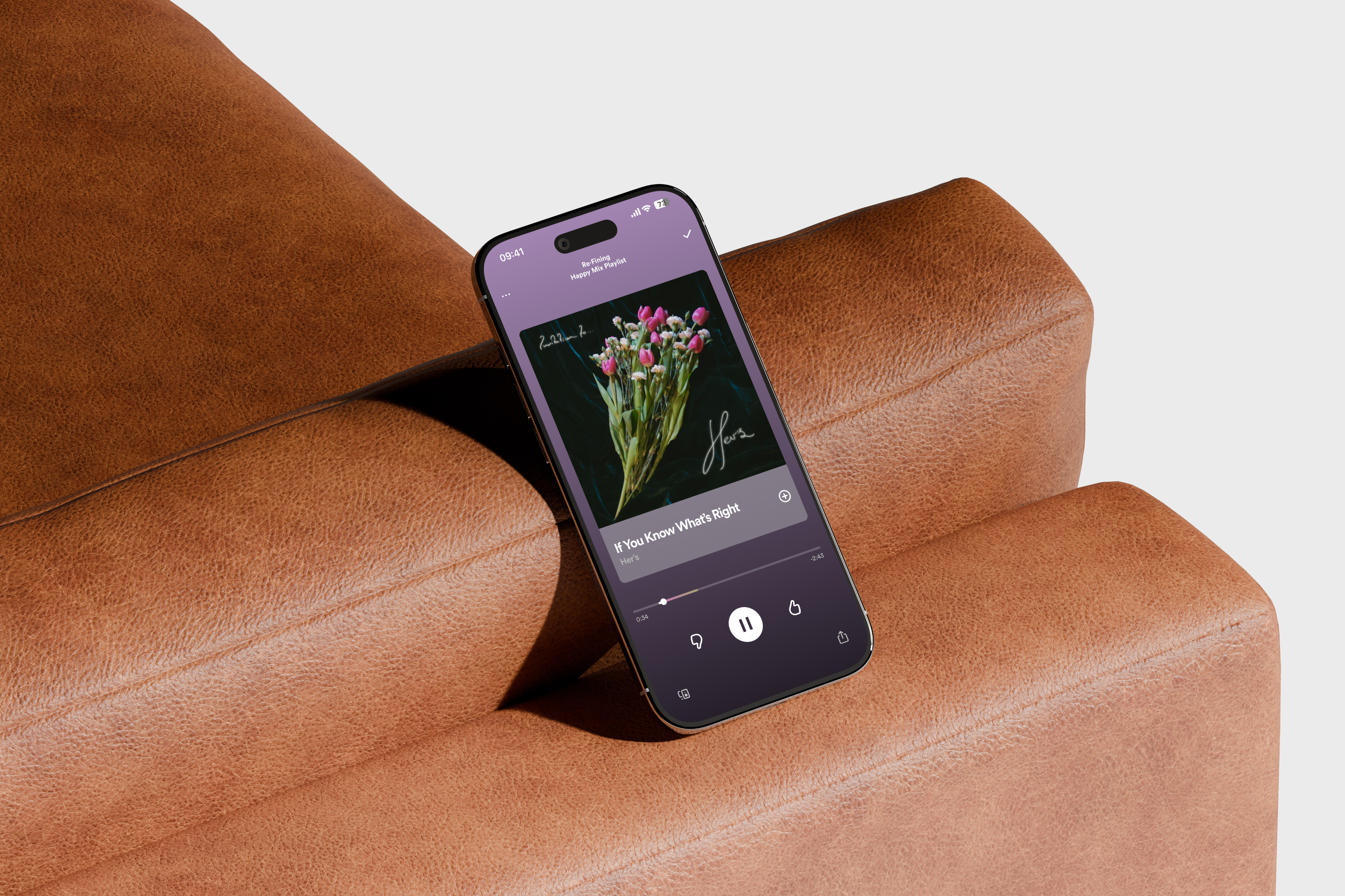
Re·Fine | A New Feature for Spotify
Re·Fine allows Spotify users to fix and improve the playlist mixes that the platform creates.
Impact

Explored how people currently discover new music and designed ways to give them meaningful control over what is recommended and why
Developed a concept that generated strong interest and positive reactions from reviewers and surveyed participants, signaling clear product appetite
Figma
Optimal Workshop
Research
Shipped Prototype
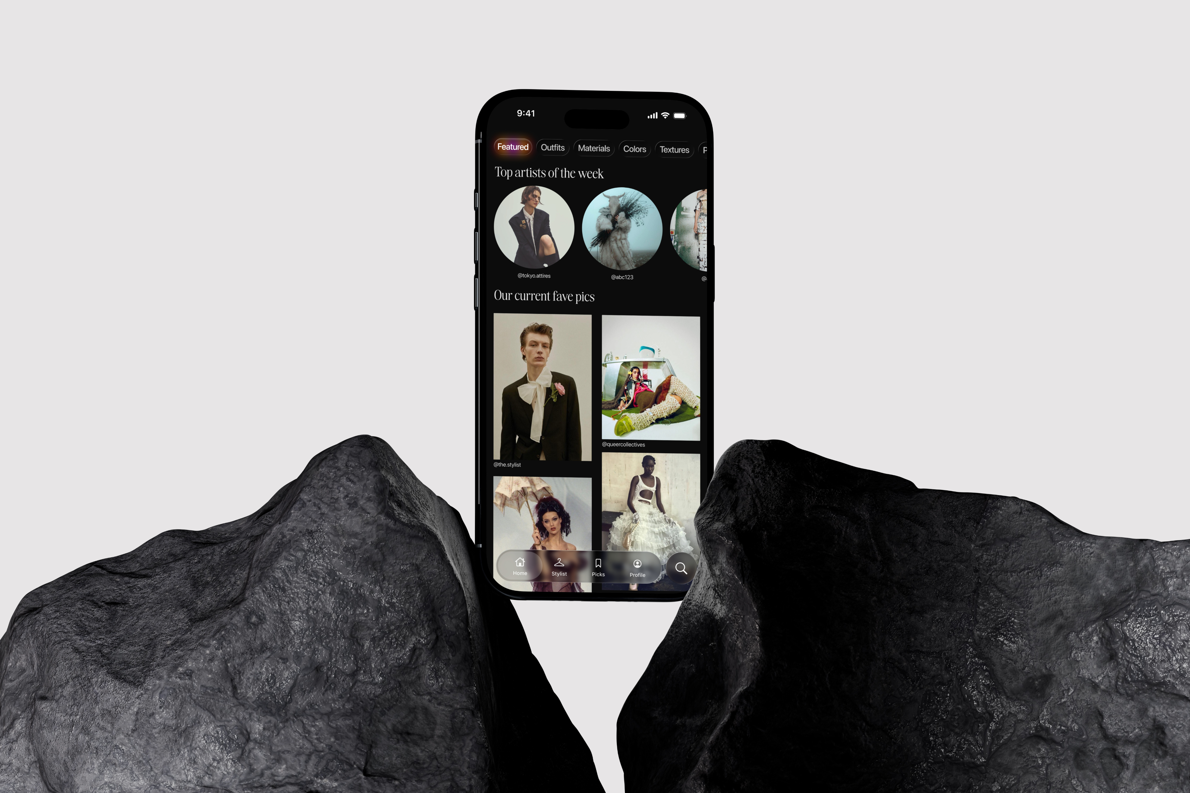
bof. | Your New Fashion Social Media
A curated fashion platform for queer communities that turns personal styling into a scalable service by combining social media sharing, wardrobe tools, and stylist add‑ons.
Impact
Translated a 1‑to‑1 styling idea into a sustainable product model, where the social platform builds audience and the stylist layer drives revenue
Designed a constrained, invite‑only posting model that keeps content high‑quality and on‑brand for queer fashion while still feeling community‑driven
Figma
Research
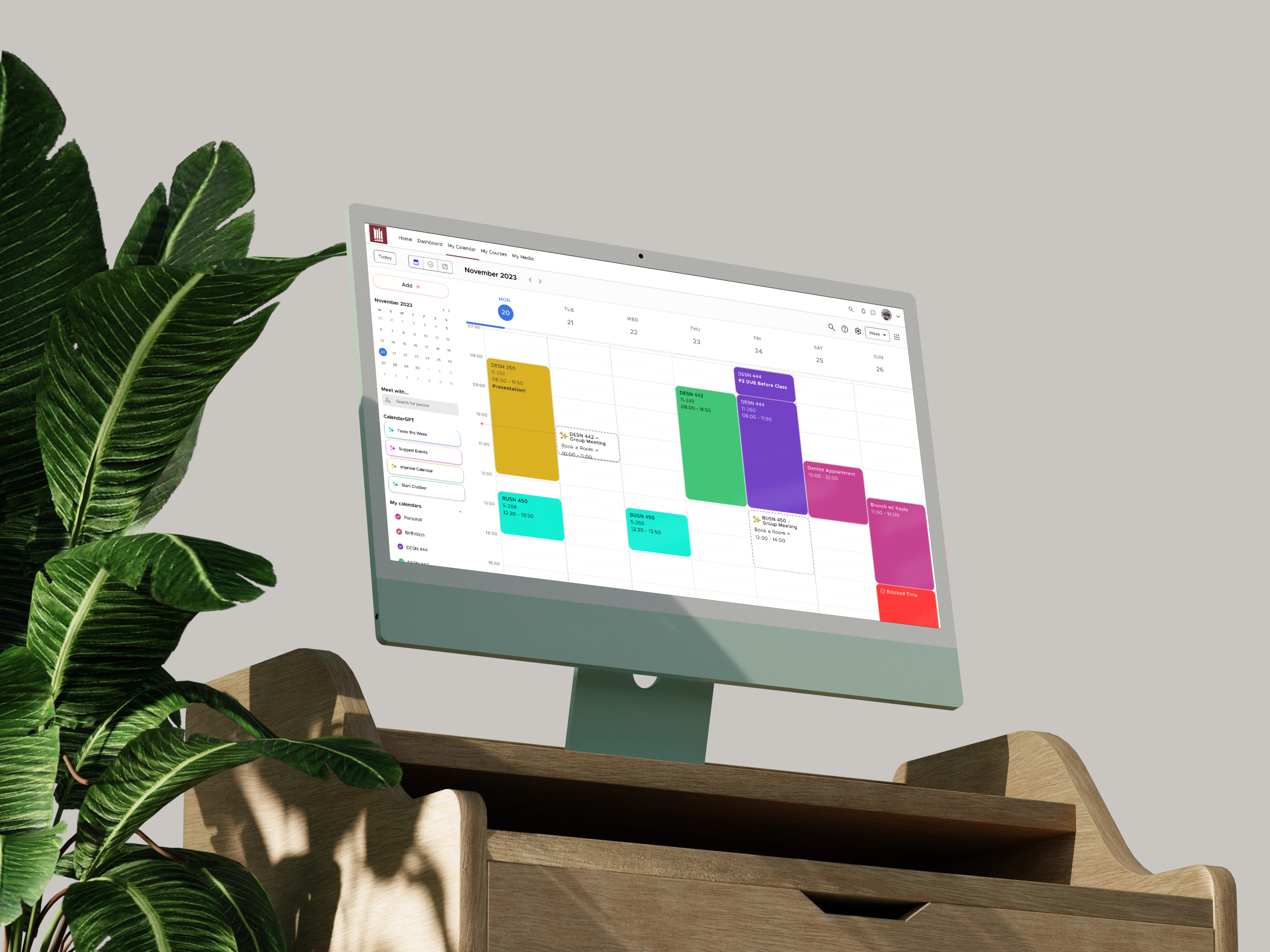
mêskanâs Calendar | A Calendar for Students
Concept Prototype
mêskanâs Calendar proposes what a calendar for students should be. With AI and student-focused features, this calendar helps students be more efficient and organized.
Impact
Designed a concept that resonated strongly with real university students, who immediately recognized it as the kind of tool they wished already existed
Demonstrated how AI and tailored workflows can turn a generic calendar into a student‑centric planner that supports study habits instead of just storing dates
Figma
Optimal Workshop
Research
Shipped
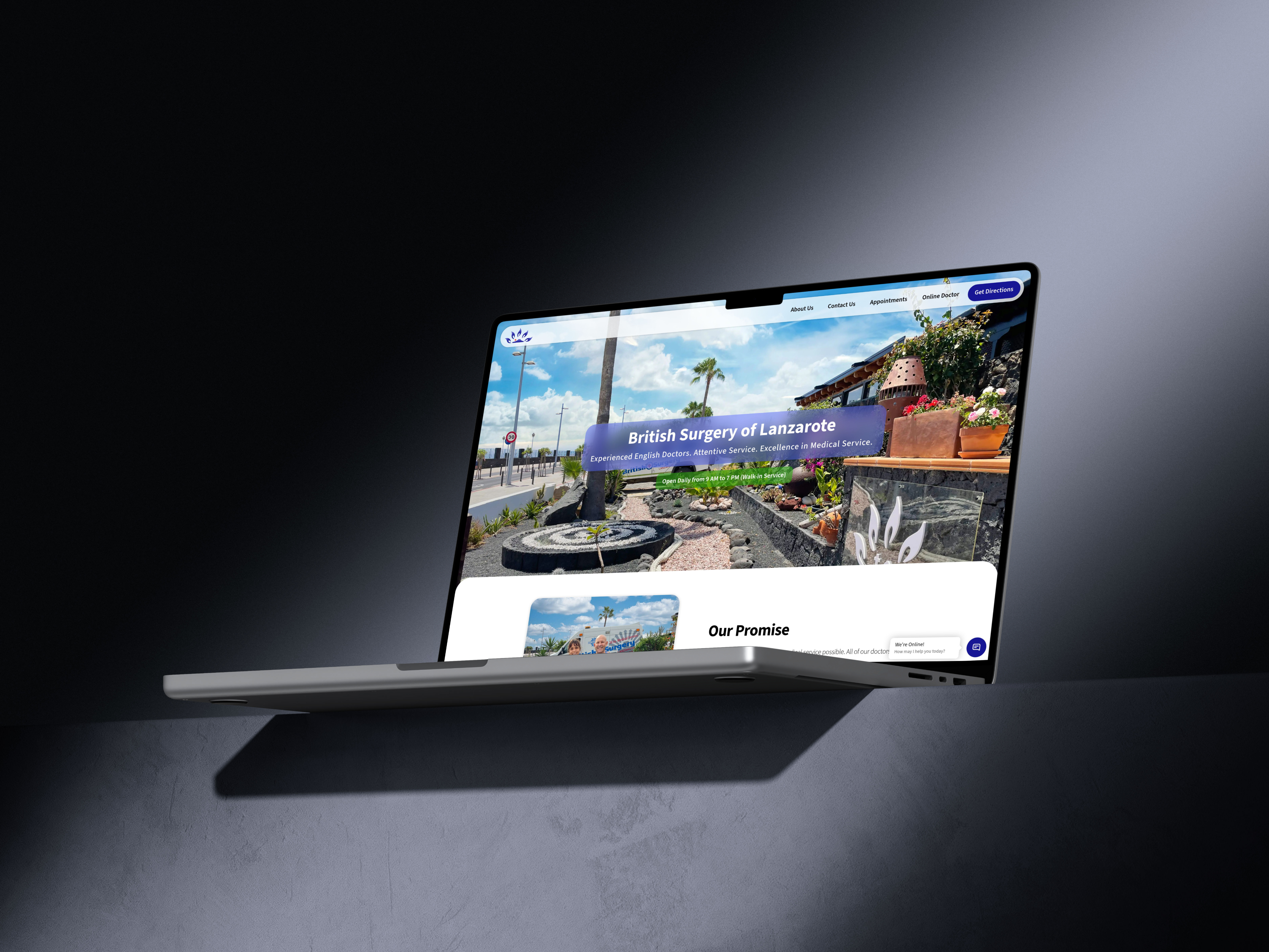
The British Surgery of Lanzarote | Making Healthcare Digital-First
Improving patient care and business efficiency through an ERP, Website Redesign and a Brand-New Digital Strategy
Impact
Took the clinic from paper‑heavy and fragmented systems to a fully digital operation, where intake, records, billing, and reporting run through one coherent ERP
Repositioned the brand as a premium, digitally competent provider, helping attract higher‑spend patients and complex cases, including luxury travellers and air‑ambulance missions
Figma
Webflow
Zapier
A/B Testing
Concept Prototype
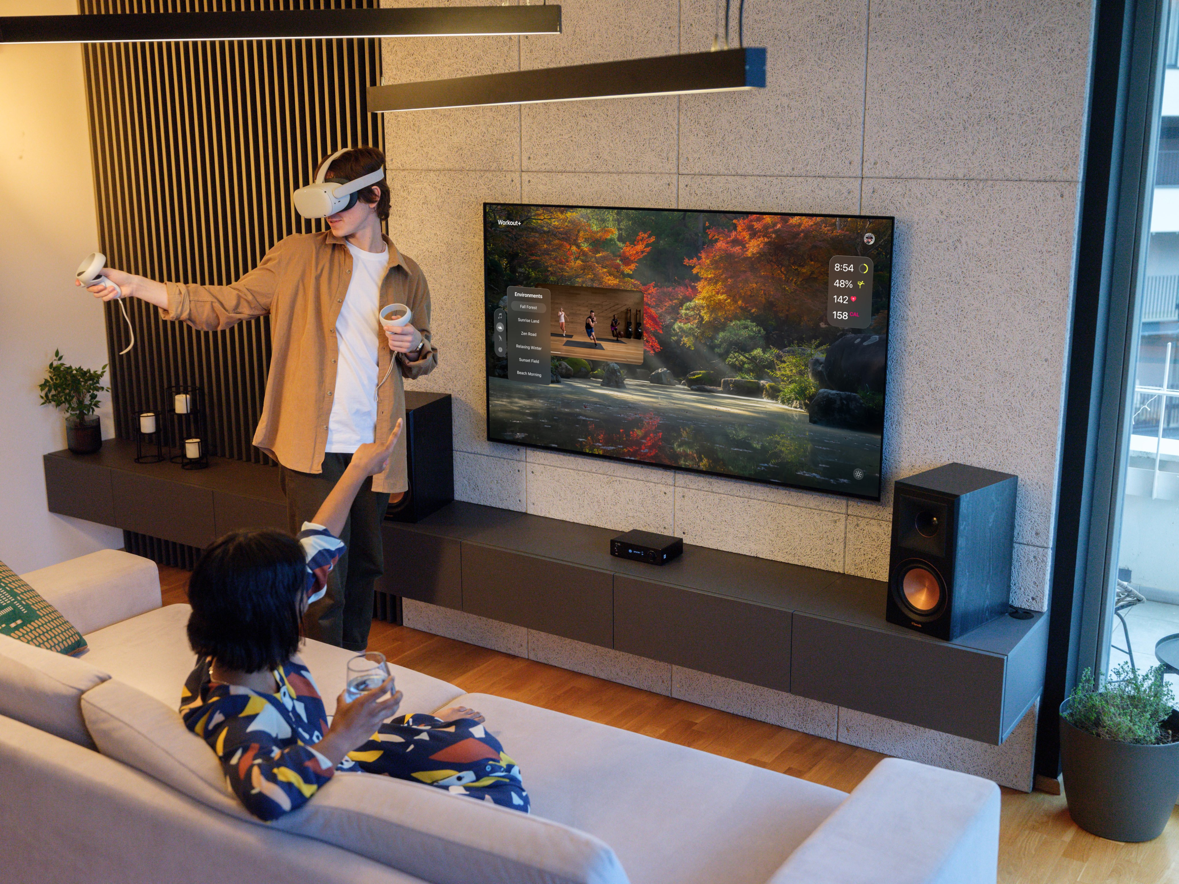
Workout+ | Redefining Exercise
Workout+ combines the power of AR/VR and Apple's Fitness+ app to create an immersive workout experience anywhere you are
Impact
Showed how AR/VR can move beyond “wow” moments and actually support better exercise habits by guiding attention, pacing, and motivation in context
Worked through the practical constraints of AR/VR and what they mean for future UX and UI patterns, from interaction limits to accessibility and comfort
Figma
Research
Tools & Technologies
Product Design & Prototyping
Figma
Webflow
Miro
Product & Interface Stack
Optimal Workshop
Qualtrics
Academic Research
Design Languages
Human Interface Guidelines
Material Design
Presentation & Handoff
Pitch
Craft
Notion
So... why is UX & UI so important?
UX and UI sit right between people and the systems a business depends on. When they are done well, customers understand what to do, staff know where to go, errors drop, and the same tools suddenly feel far more powerful. When they are done badly, even the best technology and strategy get ignored, misused, or worked around.
They are also where accessibility really lives. Accessible design rarely shows up as a neat metric on a dashboard, but it decides who can actually use a product, how independently they can do it, and whether an experience is inclusive or quietly shutting people out.
That is why UX and UI are not “just pretty interfaces.” They shape how information is understood, how decisions are made, and how reliably work gets done, which in turn makes or breaks how a business scales, stays inclusive, and ultimately succeeds.
Legal Notice
This page contains third-party copyrighted material, including brand logos, symbols, typefaces, interface elements, and other visual assets belonging to their respective owners. All projects labeled “Concept Prototype” presented here are unofficial, non-commercial, and created solely for educational and design research purposes.
The use of such copyrighted material is made under:
- Canada → The Fair Dealing Exception (Sections 29, 29.1, and 29.2 of the Copyright Act, R.S.C. 1985, c. C-42), permitting use for research, private study, education, criticism, and review; and the Non-Commercial User-Generated Content Exception (Section 29.21), which permits the creation of non-commercial derivative works with attribution.
- United States → The Fair Use Doctrine (17 U.S. Code § 107, Copyright Act of 1976), which permits use of copyrighted material for purposes including criticism, commentary, scholarship, and research. This use is supported by all four statutory factors: (1) the purpose is non-commercial, educational, and transformative; (2) the works are used as reference for original design critique; (3) only the minimum necessary elements are referenced; and (4) this use has no adverse effect on the market for the original works.
- The Netherlands → The Dutch Copyright Act (Auteurswet), specifically the quotation right (citaatrecht) under Article 15a, permitting use for purposes of criticism, commentary, and information with attribution; as well as applicable exceptions implemented pursuant to the EU Copyright Directive (2001/29/EC) as transposed into Dutch law.